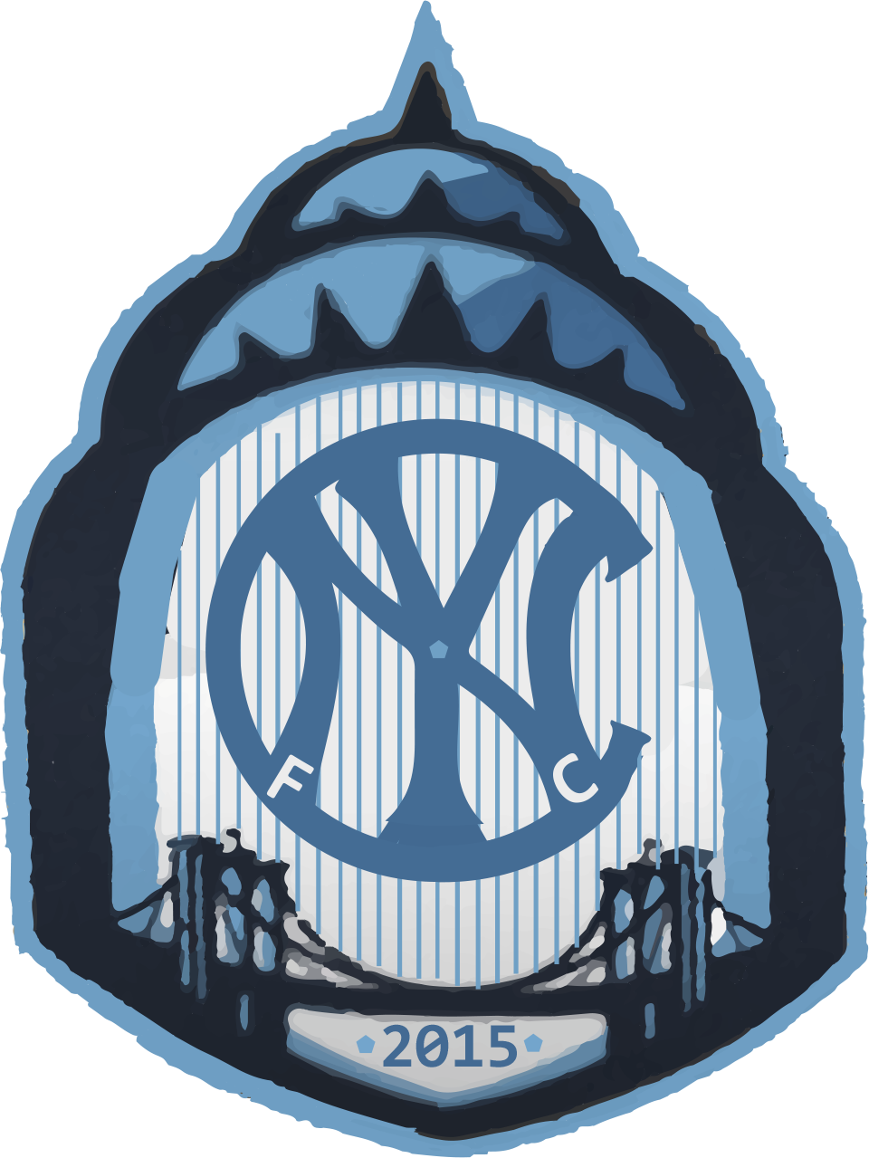
It was unfortunate, but not unexpected to hear that Jason Kries would not be continuing at Real Salt Lake. I’m sure he will have some great experiences at NYC FC and hanging out around Manchester City. Who knows maybe this is just the next step to be the future United States Men’s National Team head coach. It was interesting to learn that NYC FC had a logo design contest for their new team that fan could enter. I know this is probably way too late, and I didn’t feel like making mine perfect. However, I thought I would share what I came up with anyway. I took a couple of different ideas and put them together.
Mlssoccer.com had a nice little compilation put together. The one I like the most was from Pete Schwadel, @peteeee. I like is chrysler building outline and brooklyn bridge. I wasn’t a big fan of the beige border and star in the middle. The star seems to have not real point other than to fill up space, and I guess the beige is supposed to be like some of the Manchester City eagle gold.
In the comments for the MLS article someone posted a link to these designs from Milo Kowalski. I like his more circular design, so I incorporated something similar. I also tried to us the New York Yankees logo as inspiration since they are part owners of the team with Manchester City.
This is what I came up with. I didn’t know there was a straight on version of @peteeee’s out there so had to create a straighter one. The process made things turn out a bit funny.


Leave a Reply